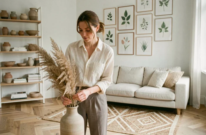
Choosing a wall color, a sofa fabric, or a light fixture is no longer solely a matter of personal taste. Recent home decor trends show a measurable shift: palettes and materials are now selected for their impact on cognitive comfort as much as for their aesthetics. Comparing color orientations, materials, and arrangements helps to identify what distinguishes a thoughtfully designed interior from a mere assembly of trends.
Key Colors 2025-2026: Comparison of Manufacturer Palettes for Interior Decoration
Two shades named by manufacturers have structured interior color choices for two seasons. Rather than following a generic color chart, comparing their characteristics helps guide a decor project room by room.
| Color | Manufacturer / Institute | Color Family | Recommended Use | Desired Effect |
|---|---|---|---|---|
| Mocha Mousse | Pantone Color Institute | Soft brown, earthy palette | Living room, bedroom, tactile textiles | Warmth, grounding, sensory comfort |
| Deep Ocean 3D Pacific 100 | Caparol | Deep blue | Workspace, relaxation area | Serenity, concentration |
Mocha Mousse pairs well with natural materials (linen, boucle wool, raw wood) and serves as a key color in a living room with earthy tones. In contrast, Caparol’s Deep Ocean targets spaces where concentration is important, like an office or reading nook, thanks to a serene blue that reduces visual stimulation.
This earthy/oceanic opposition reflects a rejection of dull neutrals. The 2025-2026 palettes favor bold yet soothing shades, structured around a dominant color rather than an undifferentiated gradient.
To delve deeper into style and furniture choices room by room, several resources compile concrete feedback, such as about the Eklectik site, which details layout options by type of space.
Neurodesign and Material Choices: What Mental Load Changes in an Interior
The term neurodesign refers to an approach to interior decoration guided by the impact of shapes, colors, and textures on the nervous system. Specialized publications for 2025-2026 document a shift: design oriented towards cognitive well-being replaces the quest for a “beautiful interior” as it appeared on social media.
Specifically, this modifies three choice parameters for each room:
- Natural light takes precedence over decorative lighting. A living room with unobstructed openings reduces eye strain more than a poorly oriented set of designer spots.
- Tactile surfaces (boucle textiles, unvarnished wood, matte stone) decrease visual stimulation compared to shiny or lacquered finishes, often associated with a feeling of coldness.
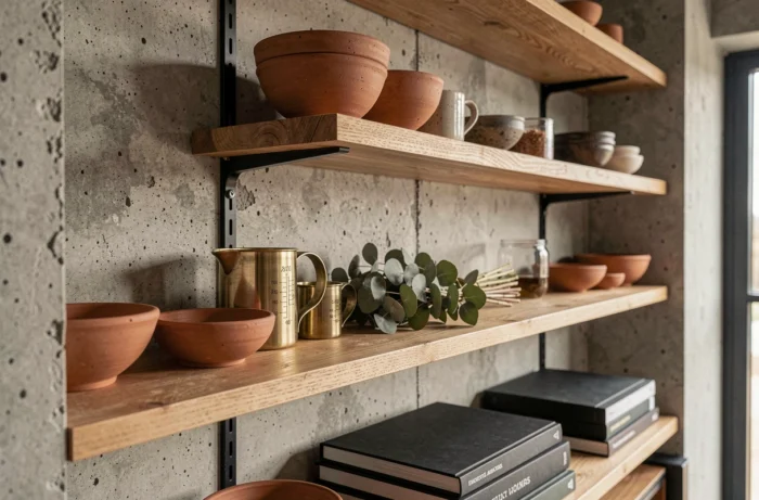
- The number of visible objects in the field of vision affects mental load. A closed storage unit, even a basic one, produces a greater sense of rest than an open shelf filled with decorative objects.
These principles do not dictate a unique style. An art deco interior with elaborate moldings can respect neurodesign if the palette remains coherent and circulation space is preserved. In contrast, a minimalist living room cluttered with “trendy” accessories on the floor can generate more visual tension than a well-ordered classic decor.
Natural Materials and Textiles in the Living Room
The 2025-2026 furniture trends confirm the massive return of rattan, caning, and light woods in living room furniture. The interest is not limited to aesthetics: these materials age without producing the rapid “outdated” effect of metal industrial furniture or ultra-shiny finishes.
A textured fabric sofa retains its visual appeal longer than a faux leather model, which reduces the frequency of replacement and, by extension, the decoration budget over several years.

Kitchen and Bathroom: Technical Spaces Where Decor Trends Clash with Constraints
Applying an earthy palette or a deep blue in a living room poses no technical difficulty. The kitchen and bathroom, however, impose constraints of humidity, cleaning, and durability that severely filter decorative choices.
Dark colors (Deep Ocean, dark organic green) on a kitchen wall accumulate grease marks more visibly than a light covering. To integrate these shades without multiplying maintenance, glazed ceramic backsplashes effectively replace paint: same chromatic rendering, simplified cleaning.
Optimizing a Small Kitchen Space Without Sacrificing Style
In a modestly sized kitchen, the choice of furniture determines the ambiance as much as the wall color. Manufacturers now offer furniture fronts in fluted wood or textured matte finishes, which add visual depth without reducing perceived space.
A countertop in Mocha Mousse (or equivalent soft brown matte) paired with light fronts creates a measured contrast. This combination works better in small rooms than a total dark look, which tends to visually compress the volume.
Lighting and Wall Art: Two Underestimated Levers to Personalize Each Room
Artificial light remains the least exploited interior decoration lever in most homes. Multiplying light sources at varying heights (low wall sconces, table lamps, pendants) radically changes the perception of a space without touching the furniture or wall color.
Three light points at different heights are enough to transform the atmosphere of a living room. A single central ceiling fixture, on the other hand, flattens volumes and eliminates the shadow contrasts that give relief to an interior.
Wall art is the other quick variable. A single large piece (framed poster, stretched textile, antique mirror) has more impact than an accumulation of small frames. The most sustainable decor ideas focus on a focal element per main wall, coherent with the room’s dominant palette.
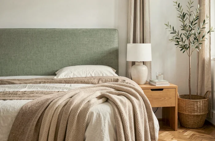
The color and material data from the last two seasons converge towards the same conclusion: a unique interior does not arise from an accumulation of trends but from a palette structured around one or two guiding shades, combined with coherent materials and thoughtful lighting. Mocha Mousse and Deep Ocean are not fleeting trends; they are chromatic markers that allow for the construction of a readable decor room by room, from the living room to the kitchen.